Windows 8. Do you think Microsoft forgot it after releasing the Release Preview? Of course not. You’re gonna’ be seeing a radical change in the way Windows appears and feels. In the Pre-RTM builds, Microsoft has already started off with a new UI. The new UI is not Metro, as you know, but something new for desktop. The desktop didn’t match with the Start Screen, right? Now, everything’s gonna’ match!
Windows 8
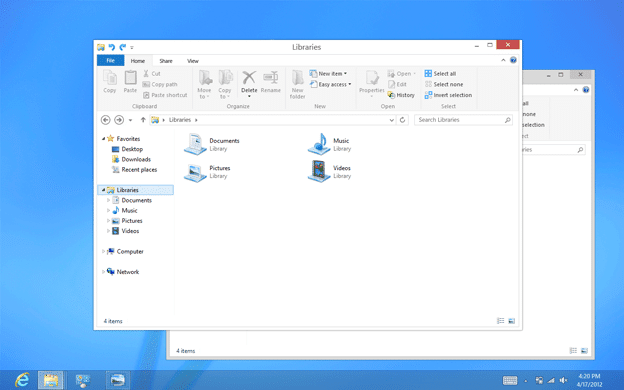
Here’s a sneak peek into the new UI:


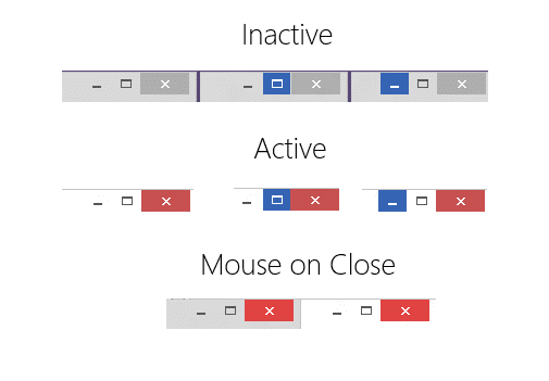
It looks so cool! Everything is like Metro now, and that rocks! Like the new control buttons? Here’s an even close look!

There’s not just the UI that Microsoft is concerned about. A lot’s going on under the hood. These are the last few days of Windows 8 Development. RTM (Release To Market) builds are being readied for the public! Many builds under the number 8500, have been compiled as RTM Candidate builds. Windows Team is now working on fixing the last-minute showstopper, the same old, annoying bugs. Till now, the RTM is really bug-free! It’s much better in experience than the Previews. After all, they were just previews! ;)
There’s still no information as to whether 8500 will be the final RTM build or 8600 or what. That’s a top-secret thing going on. However, as said before, other than bug fixing, there’s a lot going on. You can expect last-minute dramatic changes to Windows 8 for the RTM. Yes, that’s right. It’s taking an unusual turn.
In the //Build conference, Microsoft said:
In 1995, Windows changed the PC. //Build will show you how Windows 8 changes everything.
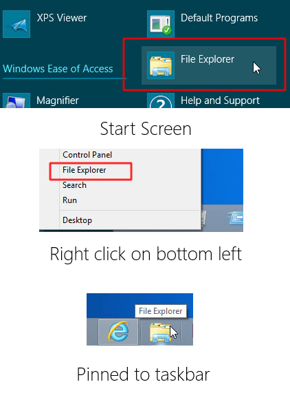
Yes. It is changing everything! You probably know what Windows Explorer is. It’s renamed. Now it is File Explorer! Wanna’ check out the proof from an 843x Post Release Preview build? Here it is:
 Windows Explorer is now File Explorer Windows 8″ class=”wp-image-4130″/>
Far as it goes, it’s not just the Window Border that is tweaked. The taskbar is also getting changed and perhaps the whole icon set (Not sure about that, though).
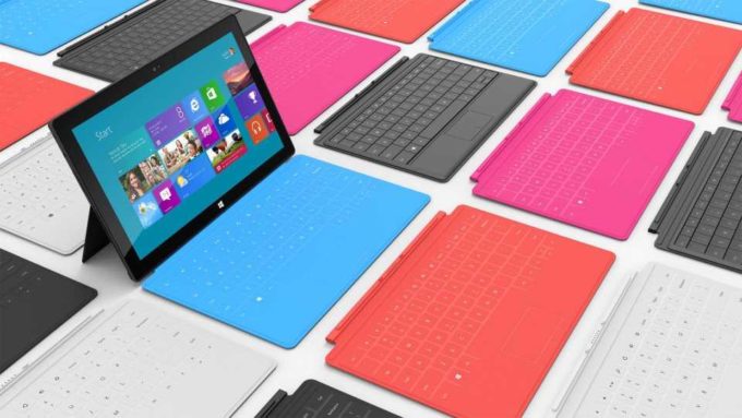
For the best Windows experience yet, I’d suggest you go with a Microsoft Surface for Windows 8 Pro. It really rocks and is coming in November. ;) A handy tablet that is actually a fully powered i5 PC. Cool enough?

This tablet of course beats the iPad and Android tablets! They run on a mobile phone OS. This one can run everything your desktop or laptop does! Do you understand? Just a little touch device can now replace your PC! :D
P.S. Thanks to Canouna, Jim (MSFT), Win8China and Neowin for the tips. ;)
Windows 8: The new UI - GizmoLord

Windows 8. Do you think Microsoft forgot it after releasing the Release Preview? Of course not. You're gonna' be seeing a radical change in the
Price: 119.99
Price Currency: USD
Operating System: Windows 8
Application Category: OS
4

The last image is out of windows -_-
Its out of the world actually :P
Yeah! :D
And, what do you mean by that?
the image withe caption “Microsoft Surface: The iPad killer ” is out of the Blog’s layout -_-
The last image is out of windows -_-
Its out of the world actually :P
Yeah! :D
And, what do you mean by that?
the image withe caption “Microsoft Surface: The iPad killer ” is out of the Blog’s layout -_-
Yes, I need one. Is that a Free developer licence?
yeah die2mrw007 me too
:D
i am already using win8
Die2mrw007, want it in July? ;)
BTW, how on earth did you start liking Metro UI? Now even the desktop is Metro. :D
Ankush, we all are. Those versions are previews. I guess you didn’t read the post. This one is the FINAL version. Didn’t it look different to you?
Yes, I need one. Is that a Free developer licence?
Yes, I need one. Is that a Free developer licence?
August – My PC will have Windows8 :)