Outlook.com
Outlook.com is the latest gig played by Microsoft, and the obsession of the company with the Metro Style is somewhat showing-off everywhere. The company has launched its Preview Outlook.com yesterday. We can say it’s the update of the Microsoft Hotmail, although the old version of Hotmail will remain active. The company has tried to make it a next level sort of thing, let’s have a Preview to find it out more on Outlook.com.
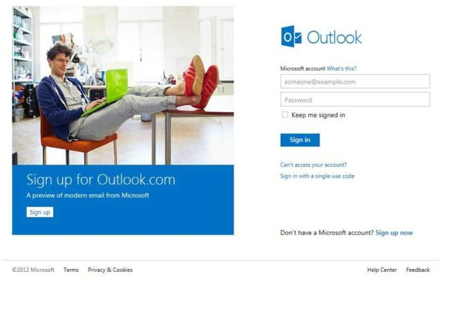
Appearance
Microsoft bring the nice and clean update this time and there motive to make it more easy user interface along with the taste of metro style is successful this time. The While using it first user will definitely feels the idea of presence of the windows 8. From a simple loading circle when sending a message to animations throughout the interface, Microsoft has pulled together the best elements of Metro and applied them to Hotmail. A dotted line loading bar at the top also matches the Windows Phone’s user interface.
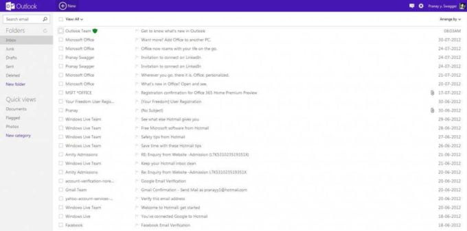
By default, the Outlook has been divided into three columns. The first column consists of Folder, Quick View, and the search box at the top in the left. Emails are lined up in the middle column and the and a new command bar on the right-hand side. Outlook’s command bar dynamically changes based on email activity, providing contact information from Facebook, Twitter, and elsewhere and also serves as an ad-place for Microsoft which generally shows Ads from the Bing Products.
The above panel bar has the Smiley-like face that gives the user access to Skype, Facebook Chat & Windows Live Chat. Through the panel bar, you can change the color(color) of the panel bar. Just as shown in the picture below:
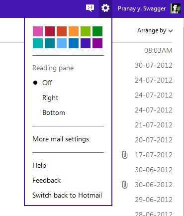
As showing in the picture user can change the Column Layout by right and bottom layout. The optional reading pane will switch the view to a four-column layout with a message preview on the right-hand side. A trio of Metro-style icons also provides access to switch between Mail, People, Calendar, and SkyDrive from a dropdown menu at the top of each section.
Brand New Look But Has Some Trace Left of Hotmail in the Outlook
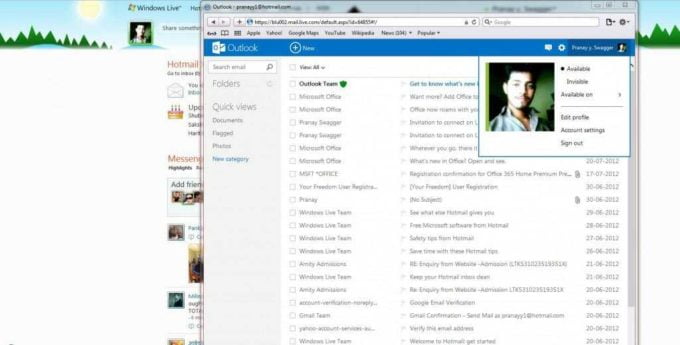
One change to the layout and functionality of Microsoft’s webmail client is the switch to default threaded conversations. Traditionally in Hotmail, Microsoft never grouped message conversations together by default, although the option is there for users to switch on. In Outlook.com, threaded messaging is enabled by default, surfacing a feature that many Hotmail users are likely unaware of. Hotmail’s legacy hasn’t been removed entirely, Junk, Sweep, and Quick View settings all remain from Hotmail, and Microsoft has ensured that right-clicking on most elements in Outlook.com will provide the usual context menus. Instant actions, such as mark as unread, delete, or a flag also appears inline in the message list.
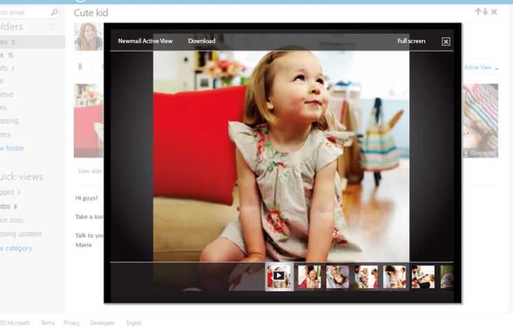
Microsoft is also pushing its SkyDrive cloud storage service here, providing the usual 7GB of free storage to share photos and video content on SkyDrive for emails, which should help free up email attachment headaches. Unfortunately, there’s still no sign of offline mail support. so if users gonna pull the plug on their connection then he’ll only be able to load emails he had previously cached.
Contacts Improved
The Contact interface is nearly identical to the Windows 8 interface and is very tempting and looks-wise is very good. In the contacts, the users can import the Contact list from Facebook, Twitter, LinkedIn & Microsoft Outlook CSV.
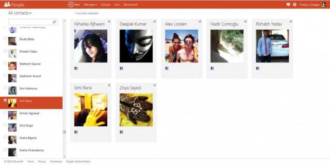
Microsoft tried to merge the all contacts into Outlook Single contact card which is Good and Beneficial but can be very tedious to handle sometimes. There are only options to view all, available, or favorite contacts. If user fill up his/her contacts with photo information and link them to Facebook then it certainly makes for a much nicer experience in the Mail client of Outlook.com providing avatar pictures in conversations.
The thing which remained unchanged is the Windows live Calender, it’s just same as the old Hotmail look.
Outlook Support
At the moment, there aren’t any standalone mobile applications, so if you want to access Outlook.com on the go you’ll need to use either a browser or any app that already supports Exchange ActiveSync. In fact, if you open the Hotmail.com app and log in using your Outlook.com credentials, you’ll be able to use the app (minus, of course, the UI you’ll get on Outlook’s full site). For now, Microsoft won’t say which mobile platforms it’s considering, or when the first apps might arrive.
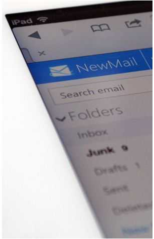
And if you’re an Outlook user and using Windows 8 and Logged into it by the same Microsoft Account then the Mail, Calendar, and People apps will be automatically configured with Outlook.com’s email, schedule, and address book. It supports very well on other platform Tab’s and while using it on Touch Devices it clearly proves that, Outlook has been targeted mainly for touch devices.
Conclusion
Besides Look, Feel and Skype Integration there is no drastic change in the Outlook and remained some features as an Hotmail. Though the Address book including Twitter, Facebook, LinkedIn & CSV and merging together is a good way to keep everything handy. But the lame arises when we find no Spam Protection by Outlook and here Gmail gets the Crown.
But as this is a Fresh Attempt and this is in Preview Stage we can hope for many other Features to get added in its Future Updates.

thanx for the download links…., gonna get it installed…
Sure, do let us know your experience too :)
I’m sure you gonna love the Clean and simplicity of it. :)
Thanks for sharing …
:)